Goal
Increase the volume of qualified travel consultation requests by translating a private, high-touch luxury consultation into a narrative-driven editorial digital experience.
Challenge
High-net-worth travelers abandon destination and special trip pages because the standard template layout fails to convey the premium, bespoke nature of the service, forcing users to treat a highly curated cultural experience as a mass-market product.
Outcome
A narrative-driven editorial platform that lifted qualified premium inquiries by 38%, cut the bounce rate on specialized destination pages from 48% to 29%, and grew organic session duration on cultural articles to an average of 4 minutes 15 seconds.
Increased qualified premium travel inquiries by 38% through a narrative-driven editorial architecture that treats destinations as visual essays rather than standard holiday packages.
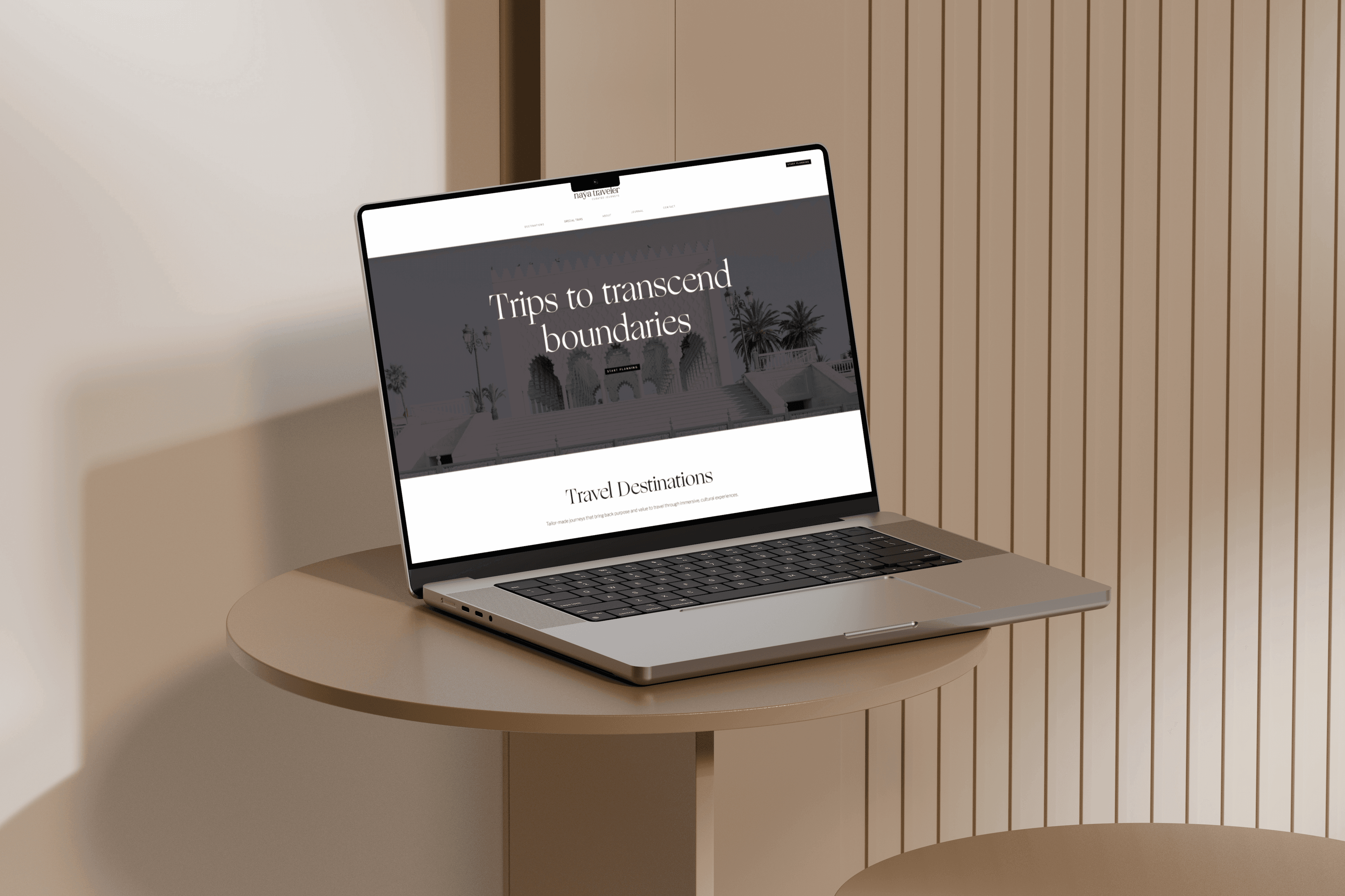
Project overview
Naya Traveler is an elite, female-owned luxury travel brand that curates hyper-personalized, culturally immersive journeys across remote global regions. The business model relies entirely on content-driven marketing to establish deep authority, gently shifting users from inspiration to high-value inquiries. The website serves as a high-end digital showroom and lead generation engine rather than a direct booking platform.
- A female-owned luxury brand curating hyper-personalized, culturally immersive journeys
- Destinations across South America, Central America, Asia & Middle East, Africa, Europe, and the Polar Regions
- A content-driven marketing model that shifts users from inspiration to high-value inquiries
- Positioned as a high-end digital showroom and lead generation engine, not a direct booking platform
The context
In the ultra-luxury travel segment, clients do not purchase pre-packaged itineraries; they invest in deeply personalized, transformative experiences. Every single bounce on a destination page means losing an audience capable of spending upwards of ₹10,00,000 to ₹15,00,000 per booking.
Our team identified that the legacy platform relied on standard, rigid structures that felt cold and transactional. This created a severe friction point for high-net-worth individuals (HNWIs) who expect a premium, high-touch consultation experience from their very first digital interaction.
Cross-functional collaboration
As the UI/UX Designer on this project, I was responsible for executing the end-to-end design layout, translating user insights into high-fidelity interfaces, and managing the components. I worked under the strategic guidance of our Design Lead, collaborated closely with the Content Strategist to align typography hierarchies with the copy, and paired daily with two frontend developers to ensure our custom interface layouts could be reliably executed within technical boundaries.
- Design Lead: strategic direction
- UI/UX Designer (me): layout execution, high-fidelity interfaces, and component management
- Content Strategist: copy and typography alignment
- Two frontend developers: technical execution
Constraints
The project had a strict timeline of twelve weeks to launch before the peak winter travel booking season. Additionally, our development team had to work within the structural limitations of the Squarespace CMS architecture, meaning any complex interactive layouts I designed had to be achieved via clean frontend code overrides without breaking the core content management workflow used by the editorial team.
Research approach
Instead of relying on generic online surveys that yield shallow quantitative metrics, our design team focused on qualitative depth interviews and behavioral observation. We wanted to understand how affluent individuals discover, evaluate, and choose bespoke travel agencies.
Who we spoke to
To guarantee our insights were credible and reflective of actual buying behaviors, we recruited twelve specific participants through targeted channels.
- Existing customers (4): recruited from the founder's direct network, having booked luxury trips worth ₹15L+
- Inquiry leads (3): past abandoned CRM leads who dropped off after filling the old form
- Travel enthusiasts (5): sourced through premium LinkedIn outreach, regular boutique hotel and private tour buyers
What users told us
A distinct behavioral pattern emerged from these sessions. Users felt that most travel websites looked identical, utilizing the same stock photography and predictable day-by-day itineraries. One user explicitly noted:
“If a travel website looks like a budget holiday aggregator, I automatically assume the ground staff will treat me like a lower-priority customer when I land.”
Competitive gap analysis
Our team conducted a thorough competitive mapping of top-tier travel publications alongside boutique agency platforms to locate our strategic opportunity.
- Black Tomato: excellent inspirational storytelling, but highly complex web navigation.
- Condé Nast Traveler: elite editorial typography and layout, yet transactional ad banners break immersion.
- Audley Travel: high operational trust signals, but feels mass-market and lacks artistic exclusivity.
- The strategic gap: no competitor combined elite, unhurried print-magazine storytelling with a direct, friction-free gateway to a deeply personalized private consultation. This became our team's design sweet spot.
Legacy homepage audit
Before sketching layouts, I performed a thorough UX audit on the active website to diagnose why we were losing potential high-value clients.
- Generic destination cards that fail to convey exclusivity.
- An immediate call-to-action button that fires before building any narrative or emotional connection.
- A lack of media features or social proof above the fold, creating a trust gap.
Problem statement
High-net-worth travelers abandon destination and special trip pages because the standard template layout fails to convey the premium, bespoke nature of the service, forcing users to treat a highly curated cultural experience as a mass-market product.
How might we
Two guiding questions framed the design exploration.
- How might we translate the feeling of a private, high-touch travel consultation into a digital editorial interface?
- How might we leverage long-form photography and cultural essays to naturally guide users toward the inquiry funnel without sounding aggressive?
The signature insight
We were not designing a standard travel website. We were designing the digital equivalent of an exclusive, private consultation room.
During user testing sessions on the legacy site, our team realized that affluent travelers were not looking for granular schedules or pricing grids on the public platform. In fact, showing an explicit itinerary made them feel the trip was rigid and pre-packaged. Under the guidance of our Design Lead, we shifted focus to sell the capability of unique curation, not a fixed, finished product.
Prioritization and trade-offs
We actively decided to remove interactive calendar selectors and complex pricing calculators. While standard travel sites rely heavily on these tools, they caused visual noise and friction for Naya Traveler. I prioritized full-width visual essays, contextual regional summaries, and single-click callback triggers, sacrificing feature density to preserve an unhurried, luxury aesthetic.
Ideation and rejected concepts
Our initial design direction explored a highly technical dashboard where users could drag and drop cities to build a tentative route. I built low-fidelity concepts for this, but internal testing proved it felt too overwhelming and mechanical for our target demographic. We rejected this complex builder in favor of an elegant, narrative-led page hierarchy that mirrors the slow pacing of a luxury lifestyle magazine.
Information architecture
To ensure the design accurately represented the live digital ecosystem, I mapped the site map and exploration routes directly from the production screens. The experience is built around a centralized conversion goal: guiding the user to the dual-purpose lead page, which supports both a deep-dive Start Planning form and an immediate Request a Callback trigger.
- Home: hero, destination slots, curated values, PR proof, and newsletter
- Destinations: regional hub spanning South America, Central America, Asia & Middle East, Africa, Europe, and the Polar Regions
- Special Trips: interest-based portfolios including Adventure & Nature, Arts & Ateliers, Dish by Dish, and Wellness Wanders
- About: founder bio, philosophy, and media press carousels
- Journal: editorial blog hub and cultural essays
- Contact: direct inquiries and general correspondence
- Start Planning: central lead form and callback engine
Mapping the user funnels
Rather than restricting exploration to a single path, I engineered the interface to handle three primary real-world user behaviors, anchoring the Start Planning entry point across the navigation bar, the homepage hero section, and the individual journal blog posts.
- Funnel A, the geographic path (high baseline intent): home page → navigation bar or grid → Destinations hub → regional sub-page → content walkthrough → contextual Start Planning banner
- Funnel B, the thematic path (inspirational discovery): home page → Special Trips section → thematic cluster → multi-country collage layouts → persistent nav CTA → primary intake form
- Funnel C, the organic content loop (SEO and editorial discovery): journal post → cultural travel story → inline service links → relevant destination page → bottom callback option or intake fields
Designing for narrative immersion
High-net-worth users are deeply influenced by editorial prestige, trust metrics, and visual authority, so the brand layout had to feel identical to an elite print publication rather than an online shop.
I implemented an asymmetric grid system with expansive whitespace, large editorial typography, and integrated media validation sections, placing the publication logos (Forbes, National Geographic, NYT) directly beneath the brand messaging rows.
Page scroll depth increased by 45%, with users spending significantly more time absorbing the brand narrative before moving to actions.
Reducing cognitive load on regional pages
Users skimmed long blocks of destination copy and missed vital regional highlights; dense paragraphs caused reading fatigue that lowered engagement.
On deep-dive destination layout variants like Mexico and Japan, I introduced staggered content blocks combined with clean text summaries to break down travel logistics (climate, visa protocols, currency) cleanly, without resorting to cheap, cartoonish icon grids.
Average time spent on destination detail hubs increased by 52%.
Accessibility and readability
I took direct ownership of the platform accessibility features, ensuring our typography remained legible over rich imagery without compromising the high-end aesthetic.
The legacy approach layered pure white text over bright landscape images, which failed WCAG AA contrast standards. I engineered a customized, mathematically smooth ambient linear gradient overlay behind the typography, easily achieving a passing 4.5:1 contrast ratio without muddying the clean photograph.
Design system
A compact, restrained design system held the platform together: a serif and sans-serif typographic pairing and a tightly controlled color palette, where generous, clean whitespace does the heavy lifting in supporting the luxury layout.
Usability testing
Our team tested the high-fidelity desktop and mobile layouts with a cohort of five premium users, tasking them with exploring a trip to the Polar Regions and requesting a custom itinerary.
The mobile form pivot
Our testing sessions uncovered a critical flaw in our assumptions about call-to-action behavior on mobile. Initially, we used a persistent floating Start Planning button pinned to the bottom of the screen, believing it would increase engagement. However, users consistently reported that it felt intrusive, diminished the premium brand experience, and obstructed their view of the immersive travel photography.
Based on this feedback, I removed the floating element entirely and replaced it with an elegant, inline contextual invitation block positioned naturally at the end of each destination narrative chapter. This approach felt more aligned with the experience of a thoughtful private travel consultant, allowing users to engage with the call to action only after fully absorbing the content.
The final product
The final layout features grand destination heroes that flow into clean regional overviews. I styled distinct subsections for climate, best times to visit, and visa details using clean typography instead of bulky icons, ensuring the presentation stays sophisticated.
Measurable business impact
To verify the success of the redesign launched in 2024, our team cross-referenced frontend analytics with the company's lead-capture data.
By removing mass-market transactional clutter and focusing purely on high-end credibility, the platform achieved its core goals: the bounce rate on specialized destination pages dropped from 48% to a healthy 29%, while organic session duration on cultural articles climbed to an average of 4 minutes and 15 seconds.
- Qualified premium travel inquiries up 38%
- Destination page bounce rate down from 48% to 29%
- Average session on cultural articles of 4 minutes 15 seconds
What we got wrong
We initially assumed that high-net-worth individuals would want direct drop-down links to all sub-regions right from the main navigation header. During early beta testing, this created an overwhelming mega-menu that completely shattered the clean, minimalist print-magazine aesthetic. Our design team realized we got this wrong by prioritizing quick link access over visual calm, which forced us to quickly pivot to the clean macro-continental buckets seen in the final layout.
What failed and what I learned
During the handoff phase, I initially underestimated the optimization required to keep heavy full-width images loading under 2 seconds on mobile networks within the Squarespace framework. Working closely with our two developers taught me that technical performance is a foundational element of interface design; slow load times completely shatter the illusion of a seamless premium service.
Future roadmap
The next step for this digital ecosystem involves introducing private, password-protected portal spaces where confirmed clients can view their fully customized interactive itineraries, maintaining the brand's high-touch design philosophy post-booking.
“We were not designing a standard travel website. We were designing the digital equivalent of an exclusive, private consultation room.”